design for public procurement
SpotGov approached tile. with the need to build a stronger digital presence for a product operating in a complex and highly technical market. As a design studio and creative studio, tile. developed a brand identity, website design system and communication direction capable of making public procurement feel clearer, faster and more accessible.
meet SpotGov
We really loved the commitment to the project, the suggestions provided and, above all, the ability to listen and meet our expectations. Very professional!
João Alves | founder & CEO @SpotGov
the challenge
The main challenge was to translate a complex B2B software product into a clear and trustworthy digital experience. The brand needed to feel credible enough for CEOs and public procurement teams, while remaining simple, modern and easy to understand.
The goal was to create a brand and website capable of giving SpotGov a stronger, clearer and more credible presence in the market. The project needed to communicate trust and expertise from the very first interaction, while transforming a complex public procurement product into something simple, accessible and easy to understand. Beyond the visual identity, the objective was to improve the perceived value of the company and create a digital presence that could support future marketing, sales and investor communication. The brand and website had to position SpotGov as an innovative and reliable player in public procurement technology, showing that the product is not only technically strong, but also relevant, professional and ready to scale.
the strategy
Our strategy was to position SpotGov as a product that removes friction from public procurement. Instead of focusing only on software features, we built the brand around clarity, speed and confidence. This allowed the visual identity, messaging and website design to work together as a single communication system.


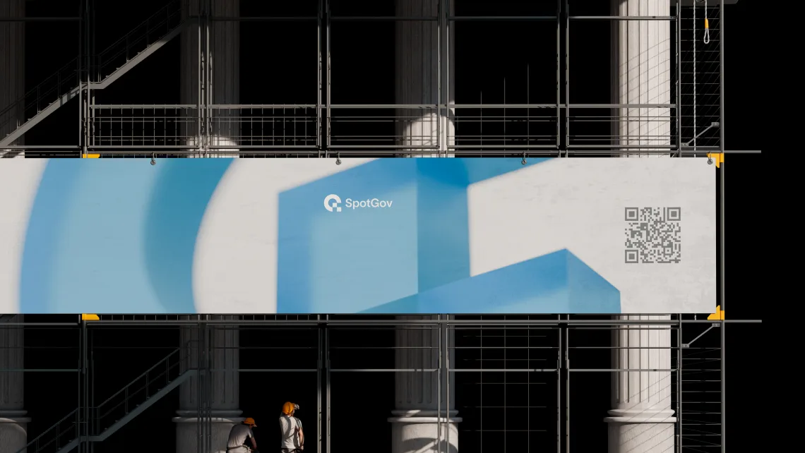
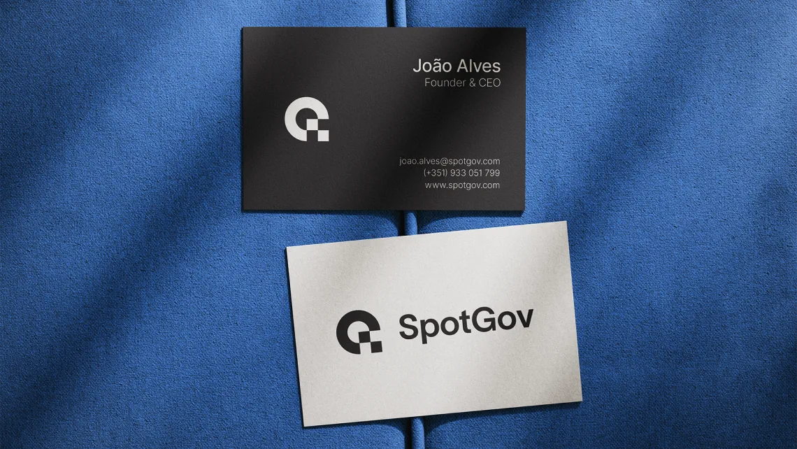
brand engineering
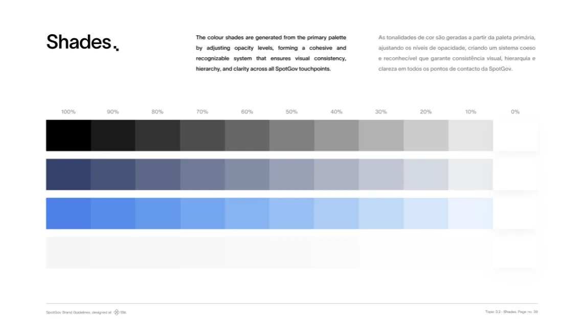
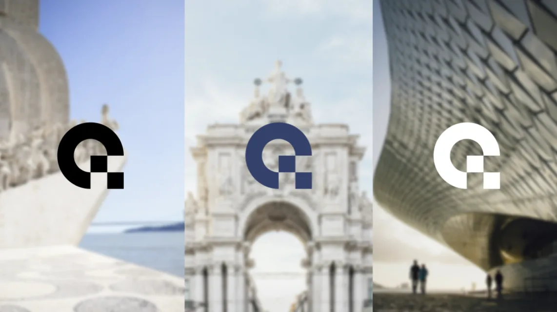
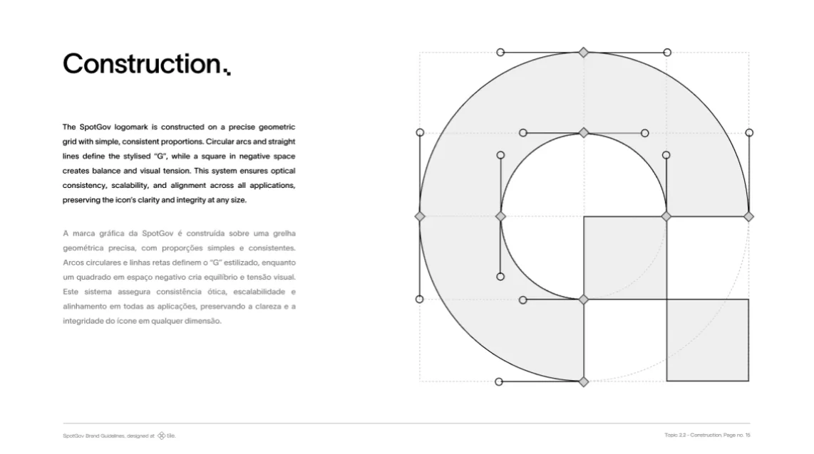
The branding process focused on building a complete and consistent identity system for SpotGov. This included communication guidelines, refined logo versions and a clear definition of how the brand should express itself across digital and commercial touchpoints — with colours, typography and layout principles that contributed to a credible, professional brand presence.
Beyond the static identity, the process also covered animating key visual elements to make the product easier to understand. These motion assets translated complex functionalities into clearer, more engaging moments, supporting the website experience and strengthening the way SpotGov communicates value.
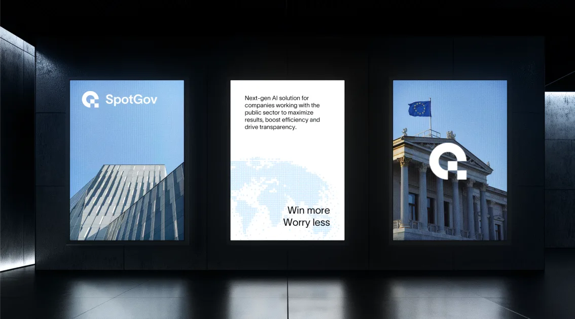
brand presence
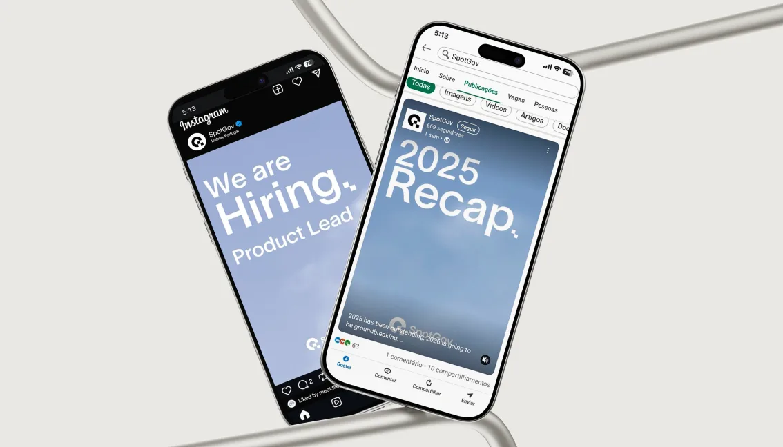
The brand presence work focused on extending SpotGov's identity across different communication channels and formats. This included the creation of presentation videos, testimonials, interviews, animations and social media posts, ensuring that the brand could communicate with consistency, clarity and impact beyond the website.
Each piece of content was designed to strengthen the perception of SpotGov as a credible, innovative and professional company. The videos and interviews helped humanise the brand and explain its value in a more direct way, while the animations and social media assets made the communication more dynamic, engaging and easier to understand across digital platforms.
web & digital design
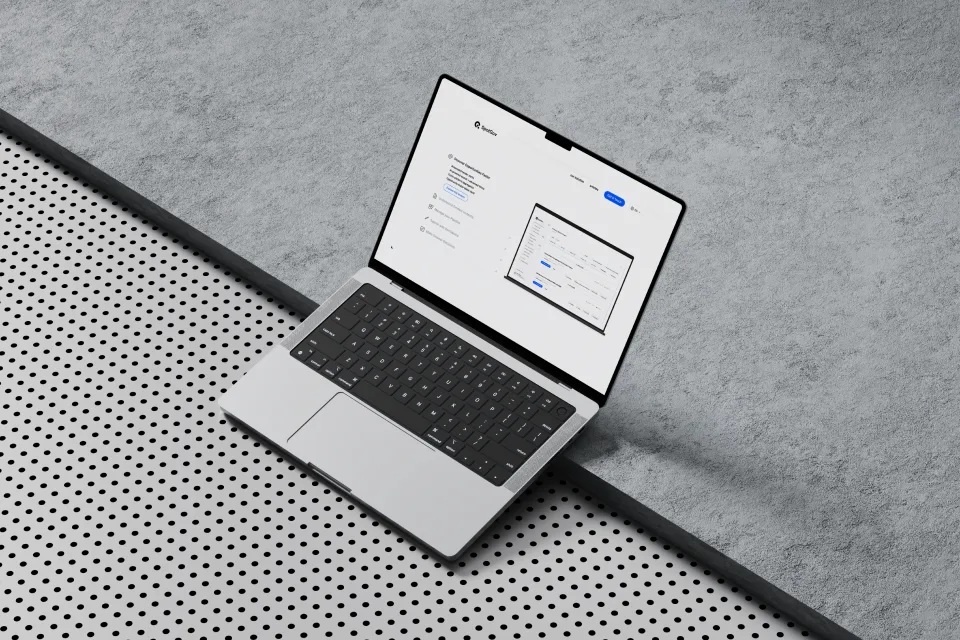
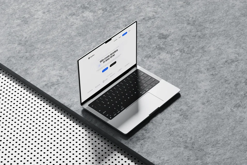
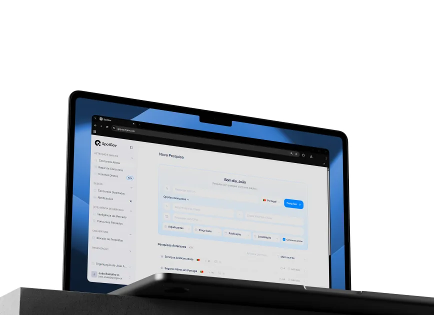
The web design process focused on creating an interactive and responsive website for SpotGov, designed to communicate the product with clarity, credibility and visual impact. The website was developed with a strong focus on structure, user experience and fluid navigation, ensuring that the brand could present complex information in a simple and engaging way across all devices.
The design included advanced motion elements, smooth transitions and complex .json animations to create a more dynamic and memorable digital experience. Beyond the visual and interactive layer, the website was also structured with SEO in mind, helping SpotGov improve its online visibility while maintaining a professional, high performance and conversion focused presence.
our solution
The visual identity was designed to feel precise, institutional and modern. The typography, layout and colour system were chosen to communicate reliability, while the interface design created a more accessible and intuitive experience for users exploring the product for the first time.